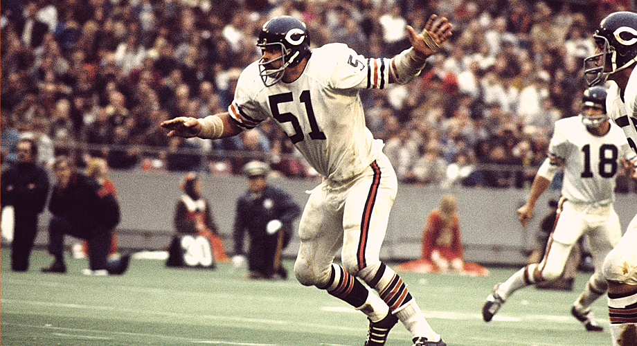
Yeah, I went there. I’ll be going many places, actually.
I’ve want a little series on here since I ended the quotes.
For now the series will be called Fuck That. Negative? Only slightly. The negativity of the image is to grab attention, and the tone will then be less negative in comparison. Hopefully. The topics will be worrying trends, annoying occurrences, and general design related things that make me sad or embarrassed.
Hand lettering is a trend, and that can not be argued. Well, perhaps it’s a movement, or even a plague. It’s sweeping across the design industry and now covers blogs, portfolios, and even client work. There are certainly masters, and those whose job it is to hand letter. There are those that are so adept at it, that they’ve virtually narrowed their services to that very specific kind of work.
That is great. My issue is mostly how hand lettering is often protected from criticism, and praised almost unanimously. The fact is that hand lettering looks really, really hard. It looks vintage, and like a craft. Especially to those who have little design knowledge. Designers don’t always want to criticize another designer for doing something they worked hard on, especially if it has that “crafted” nature to it.
The issue is that it seems apparent that instead of asking if it’s a proper solution, it’s just being done because of its aesthetics. Instead of asking whether or not hand lettering is even appropriate, designers see it and praise the skill, curves, weight, and craft. Fuck that.
The next time you encounter hand lettering, instead of tweeting it or blogging about it, think about whether someone chose to do it because it worked, or because they thought it looked cool.


